the caf2code press
Five Quick Ways to Make Your Website More Accessible

1. Improve Contrast
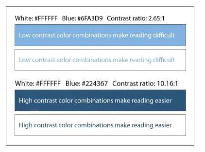
Pop Quiz, which of the two boxes is easier to read?

If you are like most people, the first box was much more difficult to read than the second box. Maybe you have amazing eyesight and still struggled. Can you imagine how much harder it is for people with vision impairments?
Ensuring the proper contrast of your website’s elements is critical to making it more accessible. If you are unsure where to begin, don’t fret. There are many tools out there to help test your website’s contrast and give you tips to improve your scores.
Contrast ratios can range from 1 to 21 (commonly written 1:1 to 21:1). One should make sure that the ratio between the text color and the background color is at least 4.5:1. However, a very high contrast color can make reading difficult for disabilities like dyslexia. The following example further clarifies this by showing two color combinations and ratios.

2. Spacing
Thoughtful use of spacing is incredibly important when designing for accessibility. Spacing helps to group like items together and makes things easier to read. This holds true especially for individuals with cognitive disabilities or visual impairment who have trouble tracking lines of text when too closely spaced. Providing the right balance of line spacing allows users to move down to the next line of text more easily.
According to WCAG:
- Line height (line spacing) should at least be 1.5 times the font size;
- Spacing following paragraphs should at least be 2 times the font size;
- Letter spacing (tracking) should at least be 0.12 times the font size; and
- Word spacing should at least be 0.16 times the font size.
3. Headings
One important accessibility principle is to make sure that screen readers and other assistive technologies can skip from heading to heading. Screen readers and assistive technologies rely on heading tags (<h1> – <h6>) to identify headings. One should use headings for their intended purposes, but not have more than one H1 tag on their pages. Not only is it not accessibility friendly, but it can also hurt your SEO.

4. Images Alt Text
Proper use of Alt text is to have meaningful images on your website. It is a tenet of website accessibility. The core purpose is to describe images to visitors who are unable to see them, especially those individuals who are sight-impaired. This also covers screen readers and browsers that block images. A good example is as follows:

Source 1: Bing
There are many resources available for developers and content owners for incorporating Alt text. They are the ones who best know what information they want the image to convey and should ask themselves “What text would I put here instead of this picture?”
- Review WebAIM Alternative Text for appropriate use of alternative text.
- Review W3C’s Alt Decision Tree for guidance
- Review WCAG guidelines on non-text
5. Typefaces and Fonts
Typefaces are groups of designed text characters, such as Arial, Calibri, and Times New Roman. Fonts are sub-sets of typefaces that have a consistent appearance, such as an 11-point font, italic, and bold font in the Calibri typeface. The size and style of the text have a significant impact on readability. Although WCAG has no minimum font size or type requirement, it is still a valid usability consideration.

Some simple rules should be considered for any user-friendly website:
- Use of simple and easily parsed fonts
- No character ambiguity or complexity.
- Not a lot of variation in typeface and fonts
- Neither very small nor very large font size to be used
Found any of this interesting? Stay tuned for more posts about developing for accessibility.
References:
- Guide to Accessible Web Design & Development | Section508.gov
- https://www.w3.org/WAI/WCAG21
- https://accessibility.huit.harvard.edu/
[1] Web Content Accessibility Guidelines (WCAG)
